Olivo
For a financial giant like BIDV, Vietnam's Gen Z population represents a critical, yet untapped, market. How can BIDV build a relationship with the next generation of customers by transforming financial anxiety into financial empowerment? I led the product design initiative to create Olivo, a personal finance management application geared towards younger audiences.
Role
Product design lead
Prototype developer
Timeline
2025
6 weeks project
Team
2 product designers
Skills
Interaction design
UX Research
The goal
How might we appeal to Gen Z users, and build a personal finance management application that can promote financial management & build healthy financial habits?
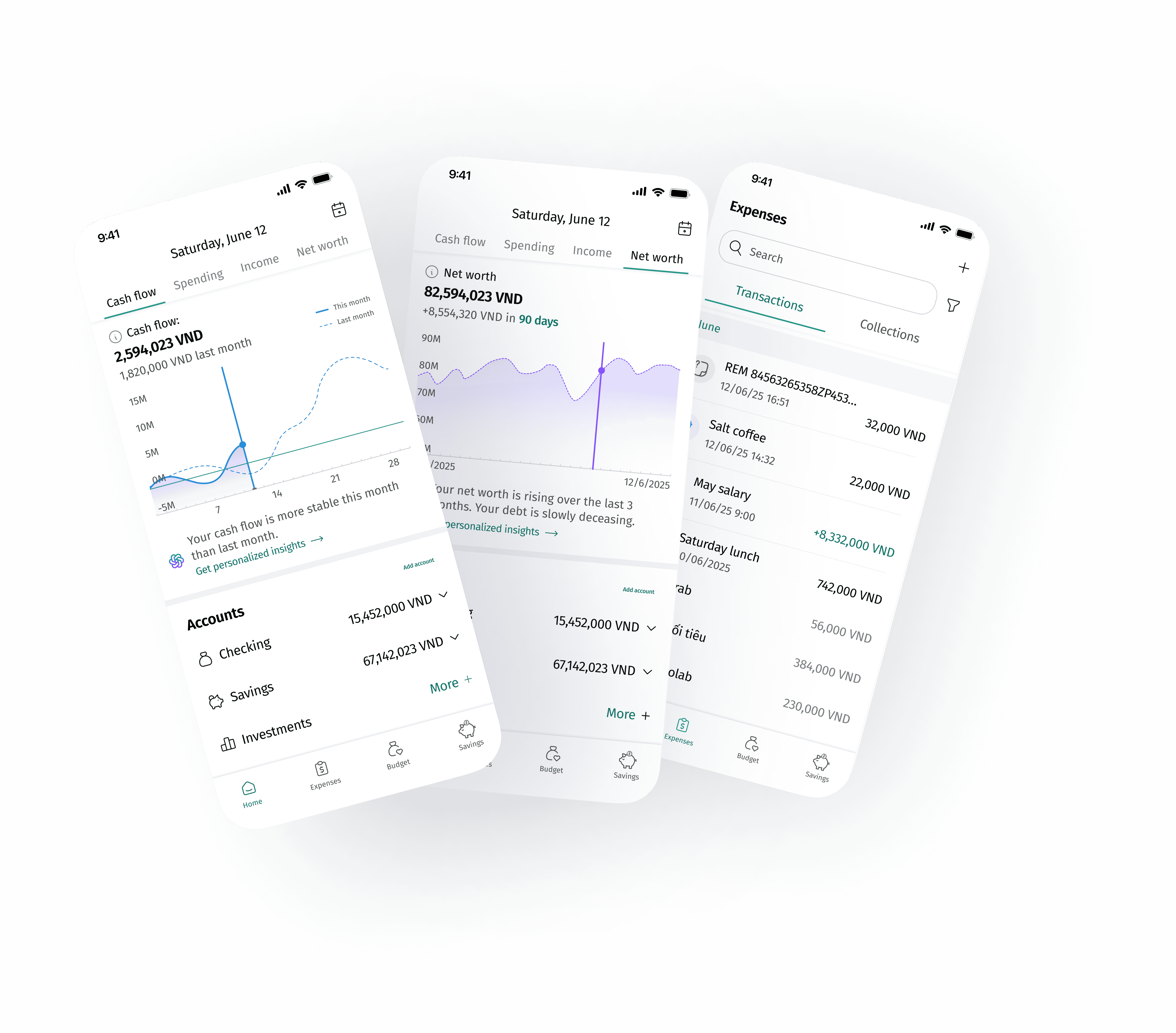
Problem 1: The Multi-Account Tracking Nightmare
Young Vietnamese users leverage multiple accounts and e-wallets, making it overwhelming to track their spending and overall financial health.
Solution
The Interactive Finance Dashboard
Designed a fully interactive, single-view dashboard to centralize balances and allow users to dynamically adjust timeframes to see daily expense comparisons against income.
Impact
Centralized finances in one view, providing clear, analyzed insights instead of static data.
Problem 2: The Burden of Expense Management
Users find manual expense logging exhausting, and bank notifications often lack the context needed to accurately identify categorize transactions after some time.
Solution
Contextual Editing via Notifications
I minimized the necessary steps by allowing users to instantly rename and recategorize transactions directly from the push notification long-press menu, eliminating the need to open the main application.
Impact
Chunked down user effort, solving the fatigue associated with maintaining financial records.

Problem 3: It's more than just numbers!
Users pay for something that brought them joy, or something they had to - connecting the experience with the numbers give users a clearer idea where they are spending their money.

Solution
Grouped Transactions & Contextual Attachments
I introduced a feature allowing users to group related transactions into 'memories' (e.g., a trip) and applied clear visual hierarchy and color coding to distinguish between single transactions and transaction groups.
Impact
Turned monotonous transactions into a record of past experiences, promoting better recall and review habits.
Our journey
We had a 6 weeks design sprint for Research, Iteration and Design.

User Empathy Map
Our target audience are those who are in their late teens to mid-twenties, finishing school and starting their career.
23 y.o. entry-level data analyst from Hanoi

Uncertain
Overwhelmed
Exhausted
Hopeful
SAYS
“I’m saving up for a trip”
“I want to save up but I want to enjoy my life as well.”
“I’ve always wanted to know more about personal finances”
THINKS
What is this transaction again?
Who looks at these graphs?
How many times did I Uber last month?
DOES
Create saving plans
Set up budgets
Understand user needs through the lens of Self-Determination Theory
I drew from Self-Determination Theory (Deci & Ryan, 2000), which emphasizes three psychological needs that drive lasting engagement: autonomy, competence, and relatedness. Each key feature in Olivo was intentionally designed to support one or more of these needs.

Design details
Building a landing screen users want to visit & charts they want to look at.
Homepage - Iteration
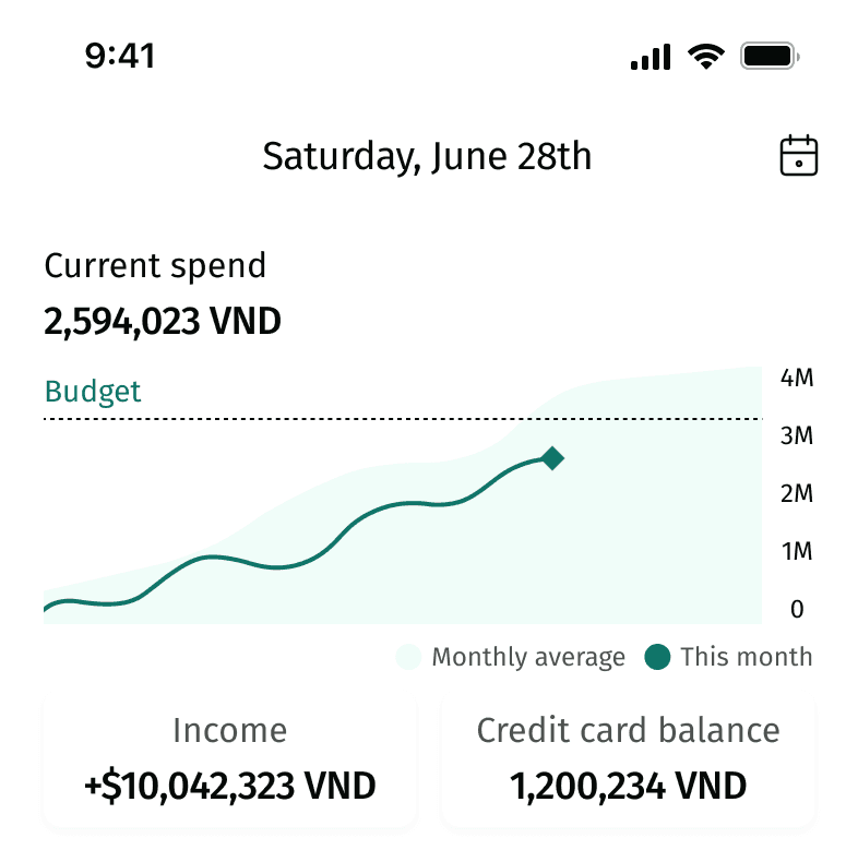
Static charts couldn't provide information users need.
The colors and information layout lack strong recognizability.
“I want to compare my spending with my income.”
Navigation to charts isn’t clear enough.
“I want to be able to see all types of charts right when I enter the homepage.”
Homepage - Final Design

Adjustable charts to track day by day expenses.
The charts are centralized via top pagination and distinguished by corresponding colors.
High level AI summary to help users understand financial trends; could expand into detailed analysis.
Minimizing the effort to manage expenses
Design Exploration
Use images to add transaction details.
Hypothesis
Uploading images reduces user effort when editing transaction details.
However,
Usability testing results show that uploading images for transactions requires significant effort from users.
Solution,
Use notifications to help users stay aware of spending and edit information if needed.

Hold down on the notification to access options, then enter a new transaction name

Auto-categorize based on transaction name.

The original transaction name is stored in the transaction details.
Applying visual hierarchy to distinguish transactions
Designing a transaction list with clear hierarchy between collections and independent transactions
Iteration 1

Expandable rows risk overlooked data and misunderstanding.
There’s no clear distinction between single and grouped transactions.
Iteration 2

The amounts of transactions within the group are lighter in color and use smaller font.
Differences in size and position disrupt alignment of the list.
Iteration 3

Replacing icons with bullet points helps restore list alignment.
The color recognizability of transaction categories is reduced.
Final Design

Enhance recognition using colors.
Clear distinction between single and grouped transactions.
List items are properly aligned.
Final delivered flows

Pitching our work


I had the opportunity to pitch this project to the entire design team at BIDV, and received their feedback on not just my design decisions but how can I make my pitch more convincing. Presenting to such an experienced team pushed me to clearly explain the reasoning behind every design choice and think about how to tell a stronger story around my process and insights.
How can this product help Gen Z users?
Centralizing finances 🏦
Centralizing finances helps users track income and expenses across accounts more easily and effectively.
Chunking down user effort ✂️
The edit-transaction feature in notifications leverages immediacy, allowing users to modify transactions encoded by the bank.
More than a number 0️⃣0️⃣0️⃣ 😵💫
Creating transaction collections links numbers to the user’s spending experiences, helping them easily recall, manage, and reflect on their expenses.
What success metrics can we use to evaluate the proposed design?
Charts engagement rate
How often do users engage with the charts when going into the app, how often do they use the AI chat features for personal finance insights?
Transation editing and grouping frequency
Are users editing the transactions from their notifications? Are users creating grou
Changes in financial habits and attitude
Are users' spendings more coordinated with the goals set out in their budget planning? Do users feel more motivated to monitor their spendings? Are users more satisfied with their financial decisions upon reflection?
What I learned
I realized that usability testing can actually tell me a lot more than user interviews. During the interviews, people shared how they manage their finances, but their answers were often broad and uncertain because they was not proactively engaged in the activity. When I started doing usability tests, watching users interact with the prototype showed me their real behaviors, such as where they hesitated, what confused them, and what they naturally paid attention to. It gave me concrete evidence to back up design decisions and ideas instead of just assumptions.
Another thing I learned was how valuable that evidence is when pitching your ideas. Sometimes it was hard to convince teammates or stakeholders why a certain design choice mattered, but showing them actual clips or feedback from the usability sessions made it so much easier as it shifted the conversation from personal opinions to what users genuinely needed.

